Building Durable Component APIs for Design Systems
Dmitry Belyaev, principal front-end engineer at Booking.com working on design systems and tooling, explains how to build durable component APIs to help make releases more predictable for teams.
Dmitry Belyaev is a principal front-end engineer at Booking.com working on design systems and tooling. With over a decade of experience in UI development, he has led design system initiatives in various companies for the past 10 years. He created the Reshaped design system to assist design and development teams with their initial steps in this field and maintains an open-source Design System Checklist, which covers the detailed requirements for common components.
Design systems have become a common practice for designing and developing products, but they’re not always as widely used as design system teams hope. As we work on driving design system adoption across the organization, one key strategy is implementing predictable releases.
Product development teams need to know what’s releasing and when. At the same time, they don’t want to follow too many updates and need to know that design system updates aren’t disrupting their product work every month.
This brings us to the topic of component properties. Properties are the entry points to any design system and system teams spend a significant amount of time planning their components’ API. Well-organized properties are vital for a superior developer experience with your design system.
Dream-driven development
Decisions tend to be influenced by legacy code and technical constraints. This often hinders creativity, preventing us from starting with a blank canvas. As a result, we often ship components based on our perspective as authors, rather than considering the needs of the developers and designers who will use them.
Before you start implementing a component, put yourself in the shoes of someone who will use it. Write a code snippet showing how it would be used in the product. Don't worry about what's currently possible. Instead, focus on envisioning the ideal component from a user's perspective.
Similar to how people say, “The best design is no design” – you can rephrase it to “The best API is no API” for component properties. An example I usually use is an early version of the framer-motion package for web animations by Matt Perry. It included a magic property that enabled automatic component animation transitions. While it didn't cover all edge cases and is no longer in the library, this feature served as an excellent starting point for considering optimal developer experience.
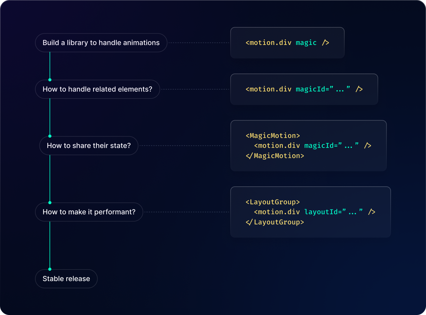
After defining this ideal state, you can gradually reintroduce layers of complexity. Consider if your idea requires more control on the product side or needs to be more performance-oriented. This approach allows you to address limitations individually and make deliberate trade-offs in developer experience, rather than imposing restrictions from the beginning.
Systematic property changes
When building new components or updating a specific component property, it's common to become too focused on the task at hand. This focus can lead to making decisions that seem reasonable in a sandboxed environment. However, it may overlook the impact of these decisions on the entire system.
Making properties consistent across all components is part of why we call it a design “system”. It may seem tedious to review the system each time a minor change is made to a component. It’s also hard to see the immediate effects of these decisions, both positive and negative. However, due to the frequent small improvements made to components, these details accumulate quickly and can become hard to reverse later.
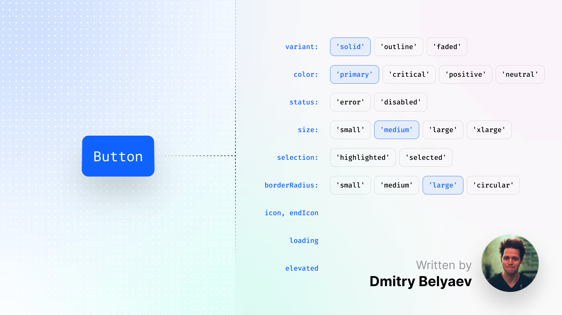
The very first thing you can improve is having consistent naming for properties and their values. It doesn’t take much time to go through your components and see the repeating patterns in them. For instance, if components have multiple design variations, it's important to avoid using different names for the property controlling this behavior in each component (such as type, mode , variant, style, etc.).
This principle also applies to the combination of property values. For example, if your button component already includes solid and outline variants and you wish to add support for a red color, consider whether this should be introduced as a new variant value or as a new property applicable to both existing variants.
Over time, I have compiled a list of common property names and values that cover the component variants used across many popular design systems. While there may be exceptions where properties are named differently, this list can serve as a useful starting point for your components:
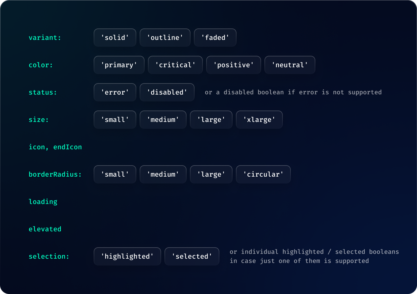
In addition to maintaining consistent names, it's important to ensure that the same values work well together across similar components. For instance, a large button used alongside a large text field should have the same height. Extra consideration should be given to how components interact with each other. For example, if your text field allows for embedding other components, designing a small button to fit perfectly in a medium text field slot can improve the developer and design experience.
Attention to these seemingly small details is important, as it enables product teams to use the design system more effectively, without creating workarounds or detaching components.
Finally, consider the potential combinations of supported property values. If you anticipate that teams will only use the three combinations outlined in the documentation, you might be surprised. Teams often begin with the documentation and then adapt based on your design and code limitations. A rule of thumb is to assume that if your system permits a certain usage, it will likely be used that way somewhere in the product. Therefore, it's important to approach property design with this mindset, minimizing the amount of unsupported property combinations.
Keeping teams unblocked
Even with a well-designed properties API for your component, it's impossible to predict all future product requirements. Therefore, it's essential to build your components with “escape hatches” for product teams. If a team submits a feature request for a component, the last thing they would want to hear is that implementation will take a month, especially if their feature release depends on this request.
As design system teams often operate horizontally, overseeing all product requirements, they typically address these through universal solutions aligned with brand guidelines. However, as the product scope expands, the development pace and response rate to product requests can slow down. Each change made not only affects the immediate request but also impacts all teams using the system. The likelihood of breaking the product increases, so design system teams need to take stability and reliability of changes into account.
Don’t be scared to provide “escape hatches” for the teams who need temporary solutions while they’re waiting for you to build it into the library.
It might sound like a controversial approach when you’re focusing on the architecture of your system and are concerned about teams sticking to temporary solutions forever. That’s completely fair. However, a worse scenario is teams being unable to complete their tasks and choosing not to use your components at all. This leads to a reduced incentive for them to migrate back to the system in the future. Plus, you lose access to any analytics about these cases, and it eventually becomes a part of the product development culture to ignore the design system.
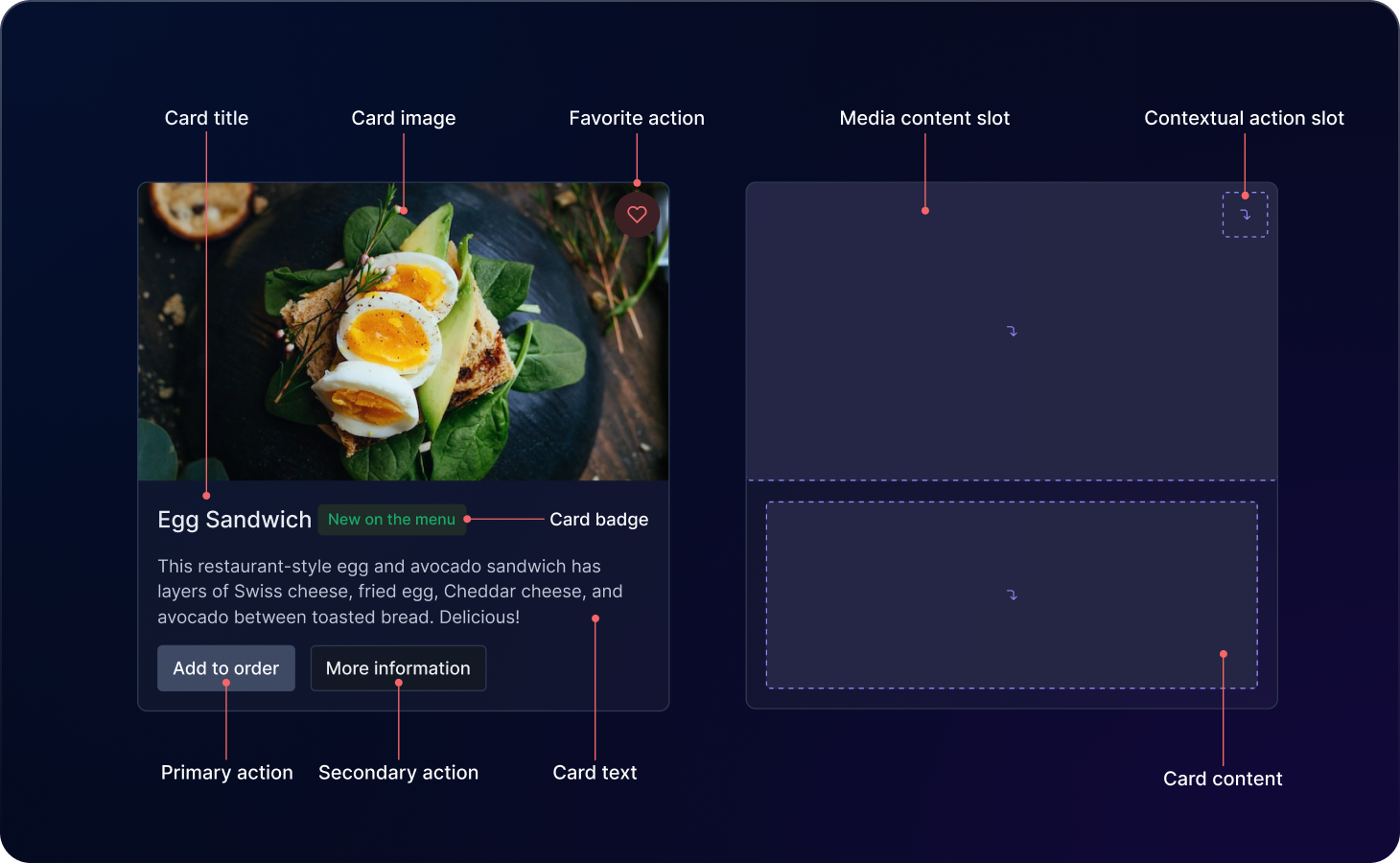
A valuable tip for this approach is to focus on component composition rather than style overrides. While style overrides may seem easier initially, they carry a risk of breaking something with every product release, as the design system team lacks information about how and where these overrides are applied. In contrast, composition is a part of your component API and gives you more information about what to expect from the product.
Platform-first properties
When building components, especially for multi-platform design systems, it's important to stay aligned with platform conventions. Ensure that your components' features are consistent across platforms, but keep their properties aligned with the platform's native language. Avoid creating new names for the sake of uniformity across platforms.
For instance, if you have an Avatar component, it's acceptable to have an image variant in Figma and an src property in your web library. Designers are typically comfortable working with variants, and developers are familiar with the src attribute in HTML image tags.
This principle also applies to components developed in different coding frameworks and languages. For example, in Swift, property values might use starting and leading keywords, while in CSS, the equivalent terms are start and end. Aligning them with the platform's standard terminology ensures ease of use for all involved, contributing to a better design and developer experience.
Implementing these practices, in reality, is not an easy job, which is why design system teams spend hours sweating the details as their adoption grows. It's important to avoid making hasty decisions and to structure your work thoughtfully.
You'll encounter numerous minor decisions that are easy to overlook and may require revisiting over time. That’s okay! Take note of what decisions have been made and why so you can revisit them in the future. It will help you a year from now when a new team member will ask you about an old decision about some edge cases you’ve agreed to handle. Treat this decision log as comments in your code but used for team-level decisions.
Finally, accept that creating the ideal API on your first attempt is unlikely. Requirements evolve, technologies update, and your system should be adaptable to these changes. Develop a strategy for implementing breaking changes and learn to phase out older features gradually, without significantly disrupting ongoing product work.
If this challenge sounds familiar to you, take one or a few ideas and try mapping them to your system. Once you have at least one of them applied – you will see how it naturally impacts the adoption.
