Creating Tokens: Navigating a World of Possibilities
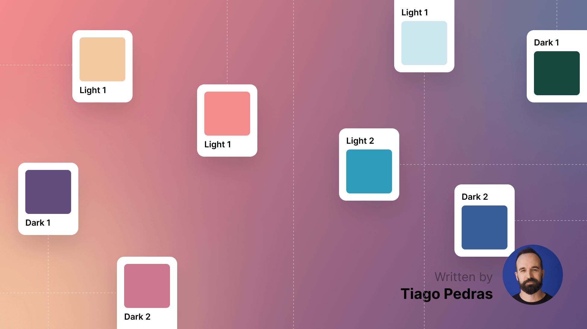
Explore the exciting world of tokens in design systems with guest writer Tiago. Learn about best practices, personal insights, and strategies for effective design token creation.
With over 20 years in digital design, Tiago Pedras fearlessly champions user needs and relishes complex discussions. As Head of Design, he not only leads but also mentors, shaping the skills of countless designers along the way.
Recently, I’ve been building a multi-layered design system for two sibling brands, a project that has proved equally challenging and fun. Along the way, I wrote down a few personal lessons on creating and managing tokens, the importance of documentation, and the dos and don’ts of code generation.
In this article, I'll share some advice and what I consider best practices if I had to do it all over again.
Start simple, then add structure
Tokens are meant to be simple things. Still, they can become quite complex as you organize them in groups. This type of structure could be depicted as a matrix of groups of similar tokens or themes. Grouping your tokens will naturally occur as you add complexity and use themes for alternative colors (or other styles). After all, this is something we designers are expected to consider these days.
The more groups you create and try to break things down and avoid duplication, the more complexity you’ll add to the final tokens. This complexity might not be apparent while building, but it will become so when you add a new theme that won’t be quite the same as others.
Be mindful of how complex and deep your token organization is because you might want to undo a few of those groups later on. “Keep it simple” is always a good mantra, especially when it comes to code writing.
Is the system for the system’s sake or aesthetics first?
When I started my latest system, my approach was to begin with visual explorations and derive tokens from those designs, which had a few pros and cons. On one hand, you know exactly what you’re aiming for, which is always a great north star. On the other hand, you’re not always thinking about the system while designing, which could lead to a bit of cleaning up while trying to create a set of consistent design tokens.
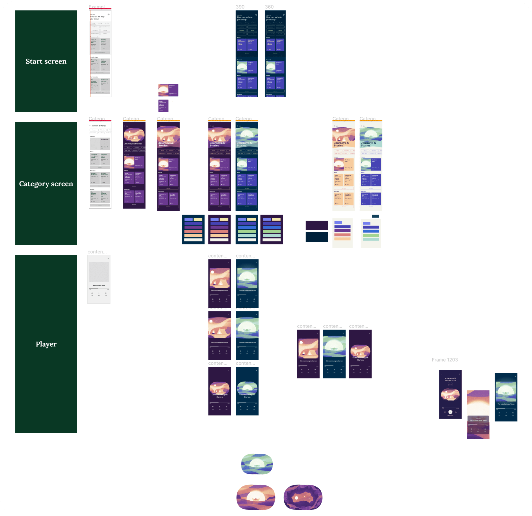
Early visual explorations already considering a couple of different themes
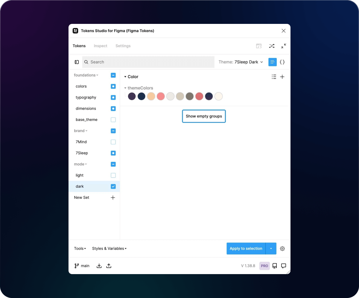
One of the simplest/latest versions of our tokens in Tokens Studio, broken down into combinable sets.
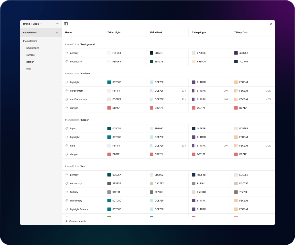
Color tokens as Figma variables, all broken down into groups and themes
While one could approach design token creation from the ground up in a super systematic way, I believe we would be giving up on a more cohesive and more strategic perspective and could end up getting caught up in creating the system for the system’s sake.
It is my opinion that if you don’t have a dedicated and experienced design system team and you’re not retroactively generating tokens for an existing system, then creating them at the start might be the hardest path. You would be better off envisioning a few screens first and later deriving the ideal token styles and structure from them.
Divide and conquer: Break things down in sets to make the most out of theming
If your starting point is a bunch of existing Figma styles that you need to convert into tokens, it’s natural to want to create most of the tokens in one go. I also tend not to plan much and structure and name things as I go.
In my last project, I didn’t consider how useful it is to create tokens in smaller groups of reusable tokens first. That way, we can link common values into other final tokens, which is a far more consistent and efficient structure that helps avoid code duplication. By identifying common values and grouping them efficiently, we generate much smarter code, kind of like how developers would do it themselves.
Theme creation also becomes extremely efficient when you have token sets you can turn on/off and combine in different ways. For example, I reused most styles across all themes apart from color in my above-referenced project. So, my themes were a combination of shared/foundational styles plus a different set of colors that I would lay on top, allowing me to easily switch between them and get a completely different look on my components.
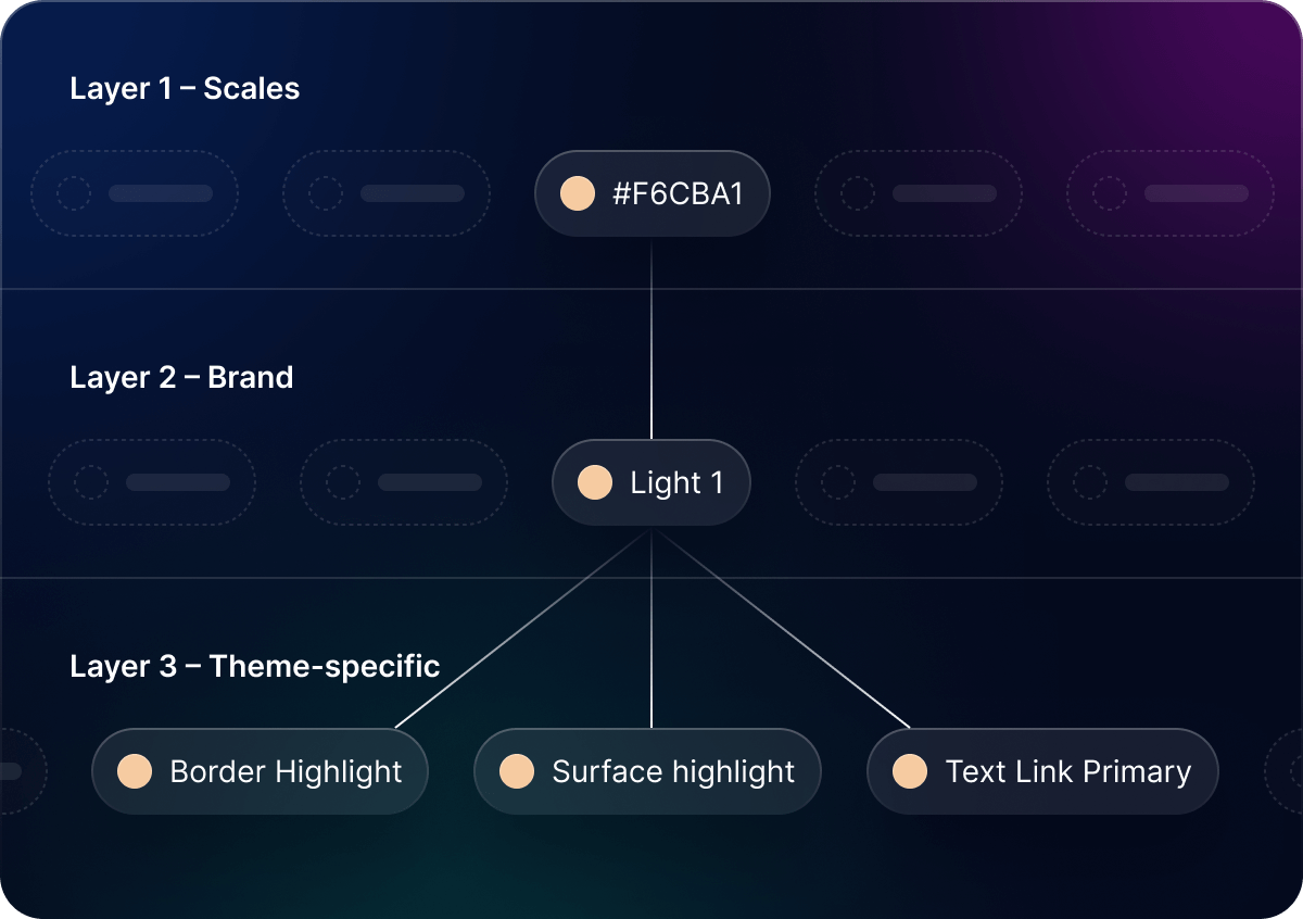
My colors also had two layers: a top semantic one that linked colors from a larger shared palette, which, although complex, is great for maintenance and future theme creation. Ultimately, the Figma variables we used in our day-to-day designs were linked to the top layer.

Don’t overcomplicate naming
I read a lot about different naming conventions online before coming to any conclusion. Many different flavors are being created, and all you have to do is pick one that suits you best.
What I’ll say on the topic is that rather than reinventing the wheel and trying to figure out things on your own, some of these conventions are more than enough for the most complex design systems and token structures. If anything else, I feel one shouldn’t overcomplicate the names of our tokens and rather keep them simple. After all, these will be the backbone of our developers' generated code. The names of your token groups matter too, as they’ll be used as prefixes in your variable names, which might make them hard to read and memorize.
The best thing I did while trying to define a naming convention while running generation tests through Supernova was to open up the conversation to developers almost daily. Together, we looked at how verbose some of our variable names had become and prioritized them for findability in Figma and Supernova’s documentation. We also made sure they were easy to write or call in code.
For instance, if I had named and grouped a token such as brandx.dark.surfaces.primary, having this turned into a variable named brandx_dark_surfaces_primary might have been a bit too much for developers to handle, especially together with 20 more all starting with brandx_dark_. So, while setting things up on the design side, consider the impact of how complex your groups are.
Document as you go
Since tokens are still new in some teams' workflows, design system documentation is crucial to ensure they're interpreted and used in the best way possible. However, while writing docs is mostly seen as a burden, it doesn't necessarily have to be a huge lift or the final step in the process.
Instead, as you bring tokens to Figma, document the steps and concepts used so you can consider whether everything makes sense for yourself and other team members. Expanding on this initial documentation with illustrations and guidelines for the end user will also save time in the future.
Writing is a form of caring and showing respect for others. When creating documentation, we empathize with our end users and consider their experience digesting the information. For example, Tiago Almeida’s approach to effective documentation at Volvo is a valuable resource. He provides insights into how to design system documentation in a user-friendly manner. Here's one of his posts on this topic.
The benefits of thorough documentation might not be immediately evident to the team members involved in its creation. However, for those who join the team at a later stage, well-structured and comprehensive documentation could prove to be immensely valuable. It could facilitate their onboarding process and significantly boost their productivity.
If you start early, once your design system is stable, you’ll have all the thoughts and content you’ll need to start creating a more final and clean home for your documentation. I’ve been using Supernova’s documentation feature and it would have been a much harder task if I hadn’t started writing my docs content earlier.
Final thoughts
Design systems can become very technical very quickly, so it’s important to consider them as products you and your team use. Design tokens should not become another layer of cumbersome complexity but rather provide a simple way to expand and keep open doors for improvements. You won’t fully understand their power until you’ve tried them out and failed at it. But with some practice, I’m sure they will become as ubiquitous as drawing the simplest of shapes. Thanks for reading.
