How To Create Accessible Design System Components
Discover how to prioritize accessibility in design system components with expert Geri Reid. Learn valuable insights and practical tips for enhancing your design system's inclusivity.
Learn how to research and spec design system components with accessibility at the forefront with guest blogger Geri Reid.
Geri Reid is on a mission to design inclusive products that work for everyone. As Design and Accessibility Lead on the NewsKit Design System, she worked with leading media and broadcast brands. Before that, she was Design Lead on the Constellation design system at Lloyds Banking Group and Principal on the design systems team at Checkout.com. She is a keen accessibility advocate, speaker, and documentation nerd.
Our design system components are accessible
Working in design systems, I regularly hear this claim. But what does it actually mean? Components are the building blocks that make up a website's user interface. You can build a product that is completely unusable from components that all individually meet accessibility standards. So is there really such a thing as an ‘accessible design system component’?
Over time, I’ve learned the important bit is considering accessibility from the start of the process. Forget the label! Like most aspects of design systems, accessibility is all about the journey, not the destination.
This post sets out the process my team on the NewsKit Design System followed to spec components with accessibility at the forefront. I’ll share resources and actionable takeaways you can apply to your own design system or product design workflow.
Where to start?
Digital accessibility is about making sure that everyone has equal access to your product or service.
If you’re new to accessibility, check out the W3C Introduction to Web Accessibility, which covers why accessibility is important and how people with disabilities use the web. When digital products are thoughtfully designed and coded, everyone can use them. If more people can use your website, more people can buy your product or engage with your stuff which is just smart business sense.
Component research
Setting the standard
Always start with accessibility and coding standards. If you establish a component’s HTML structure and accessibility considerations upfront, it will save you unnecessary headaches down the road. As a designer, this has also helped me get a better technical understanding and appreciate any limitations. Here are my four starting points when researching component best practices:
WCAG
The industry-wide measure of accessibility is WCAG, the Web Content Accessibility Guidelines. Most organizations aim to meet a WCAG AA standard, meaning most users will be able to engage with your product.
WCAG is pretty overwhelming and unless you know what you’re looking for, it can be hard to know where to start! Thankfully the Web Accessibility Initiative (WAI) has some simplified guidelines on how to write, design and develop for accessibility. For component-specific guidelines, check out the WAI’s web accessibility tutorials and the patterns section of the ARIA Authoring Practices Guide.
MDN docs
My second stop for component research is MDN web docs. Search for the component you’re researching and you’ll find the semantic HTML structure, attributes, and any accessibility concerns.
Online resources
Vitaly Friedman’s Complete Guide To Accessible Front-End Components aggregates hundreds of useful links. If the component you’re working on is featured in Heydon Pickering’s Inclusive Components, then hurrah, the work has been done for you!
Other design systems
I’ll also take a look at other design systems. The Component Gallery and Design System’s Docs Search are aggregators of design systems where you can search for the component you’re researching. Making a paste-up of design system docs in a whiteboarding tool like FigJam or Miro can be useful for comparison.
A word of warning here – just because it’s in a design system doesn’t mean it’s accessible or appropriate for the users of your product. Exercise caution and always do your research.
Research a breadcrumb component with me
I’ll be using a breadcrumb component in this post to demonstrate each stage in the process. Most of you will be familiar with a breadcrumb – a horizontal list of links that helps you navigate complex websites. A breadcrumb trail for a post in the Supernova blog might look like this:
At NewsKit, here’s what our initial research into breadcrumbs turned up:
- Breadcrumbs are covered by WCAG 2.4.8: Location
- Breadcrumbs consist of a set of links, structured using an ordered list
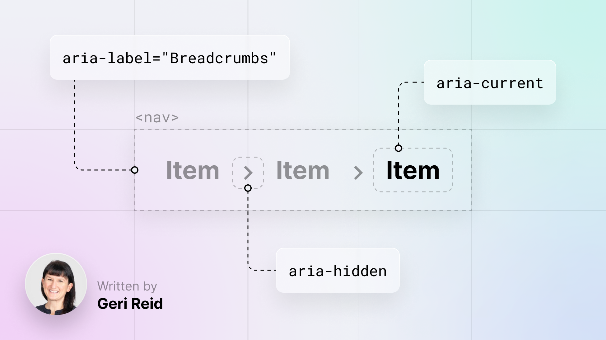
- Wrap breadcrumbs in a nav element. This will help users of assistive tools like screen readers to identify the breadcrumb trail as a navigation landmark. Use aria-label="Breadcrumbs" to label this landmark
- The separators between breadcrumb items are non-interactive. You can make them a decorative element to prevent screen readers from announcing them using aria-hidden
- Add aria-current to the current page link
If you’re just starting out with accessibility, I appreciate these findings might have you scratching your head! Hang in there, we’ll unpick what these points mean as we work through the spec together.
Component anatomy
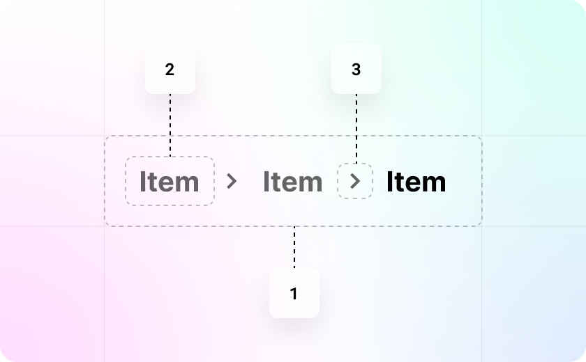
Now you’ve done some research and have an idea of the underlying HTML, you can use this knowledge to map out the anatomy of the component. A component is likely to be made up of smaller building blocks like icons, buttons, links, and lists. Sketching an anatomy diagram can help communicate your thinking with the team and, in the case of a complex component, agree on naming conventions for elements and wrappers.
Breadcrumb component anatomy

Include all the options
You’ll need to define the options your component will need for different use cases. If the component brief has come from a consuming team, make sure you discuss all their requirements. It might not be necessary to build all features upfront, but understanding the scope from the get-go will allow you to make sensible choices that allow for future scale.
Some options to consider are:
- Appearance – solid, outline, minimal
- Size – small, medium, large
- Intent – success, alert, warning, information
- Icons – leading, trailing
- Placement – left, right, top, bottom
- Orientation – horizontal, vertical
Breadcrumb options
For the NewsKit breadcrumb component, we included two options:
- Size: SM, MD and LG, for visual consistency with other components in the system
- Customisable separator: Consumers can override the default icon or use an alternative component in place of the icon
Consider all the states
If your component is interactive, you will need to consider states. For a form component like a checkbox that supports validation, there might be more states than you anticipate! Visually spec out states to check for sufficient color contrast and the visual difference between them. WebAim has a helpful guide on color contrast accessibility if you’re unsure.
With HTML elements like buttons and form components, the styling of states will default to the browser’s default styles unless you specify styles. A clear focus indicator that highlights the currently focused element is vital for accessibility – it helps sighted users see where they are on the page and navigate. For a deep dive into focus indicator accessibility, check out Sara Soueidan’s Guide to designing accessible, WCAG-compliant focus indicators.
Breadcrumb states
Here are the states we included:
- Base
- Hover
- Focus
- Selected
How should the component behave?
Spec out the component behaviors.
- Is it full or fixed width?
- Does the text wrap or overflow?
- Does it require validation?
- What happens when you resize your browser?
Have a look at how this component behaves on other websites and revisit any requirements to decide on appropriate behaviors.
Breadcrumb behaviors
We kept the breadcrumb’s behaviors simple:
- By default, the current page breadcrumb item is displayed as non-interactive
- The final, trailing separator is hidden by default. It can be set to visible if required
Keyboard interaction and focus order
Keyboard interaction is essential to web accessibility. It can help people who are blind, people with physical disabilities, and many people without disabilities prefer to navigate by keyboard as it’s often just more efficient.
All interactive elements in your component — like buttons, links, and controls — must be accessible by keyboard alone. The Tab key is typically used for moving between each interactive element, the Up and Down keys for scrolling, and the Spacebar or Enter key for interaction.
Think through a logical and intuitive tab order for your component, following the visual flow of the page from left to right and top to bottom.
Breadcrumb keyboard interactions
ARIA
Accessible Rich Internet Application, or ARIA is a set of attributes you can add to HTML elements to make them more accessible to people who use assistive technology, like screen readers. ARIA helps in instances where HTML doesn’t expose information to assistive tech. To learn when to use ARIA versus HTML, check out web.dev’s Intro to ARIA.
Adding ARIA tags to your components can be helpful for consuming teams. Be sure to document usage and indicate if the attributes work as default or need to be customized.
Use ARIA with caution! Adding ARIA to an element does not automatically make it more accessible. Used incorrectly, it can actually make the experience worse or even be a total roadblock for folks who use assistive technology. Check out WAI’s No ARIA is better than Bad ARIA for the low-down.
ARIA attributes for breadcrumb
Here are the ARIA attributes we assigned to the NewsKit breadcrumb component. These were informed by our initial research and by the choices we made around options and behaviors.
Props and overrides
Once you’ve set out your specification, think about the props and overrides needed to support the options and behaviors you’ve defined. I like to put myself in the shoes of the user and step through the component functionality. In our breadcrumb example, I’ll need a prop to set the size and to show/hide icons. Some overrides to change the styling and padding would be useful. You can check out NewsKit’s full breadcrumb API table here.
Share for feedback
At this point, you’re ready to share your specification for feedback. If the component is a request from a consuming team, it’s sensible to meet with them to run through the spec to check you’re meeting their requirements. Make a point of highlighting the accessibility considerations.
Share widely with engineering and design. On the NewsKit team, we ran a weekly tech analysis session where we’d all pitch in, review the research and make suggestions. As a UX designer working on a spec, it can be easy to overlook something and our engineers would often suggest a better way or a new coding practice I wasn’t aware of. It takes a village to raise a component!
When your component spec is in shape, you can move on to the build and write the supporting documentation. That’s for another post! Make sure your definition of done includes both automated and manual accessibility testing with assistive tools.
Conclusion
A considered process for researching and speccing your design system components can help set a high standard for accessibility in your organization. While this won’t automatically equal an accessible end product, it provides a solid foundation.
A small amount of effort upfront by the design systems team can have a wide impact as multiple products consume components. And by setting a high standard for coding and accessibility, the systems team can also help amplify the quality and the importance of accessibility throughout the organization.
Whatever stage you are at with design systems accessibility, I hope you've found some takeaways here. Every team setup is different and by sharing processes we can learn from each other. Creating NewsKit components was a team sport, and the heavy lifting on this research was done by designers Mike Messina, and Valeriia Bielozorova, and engineers Stoyan Delev and Marco Vanali.


